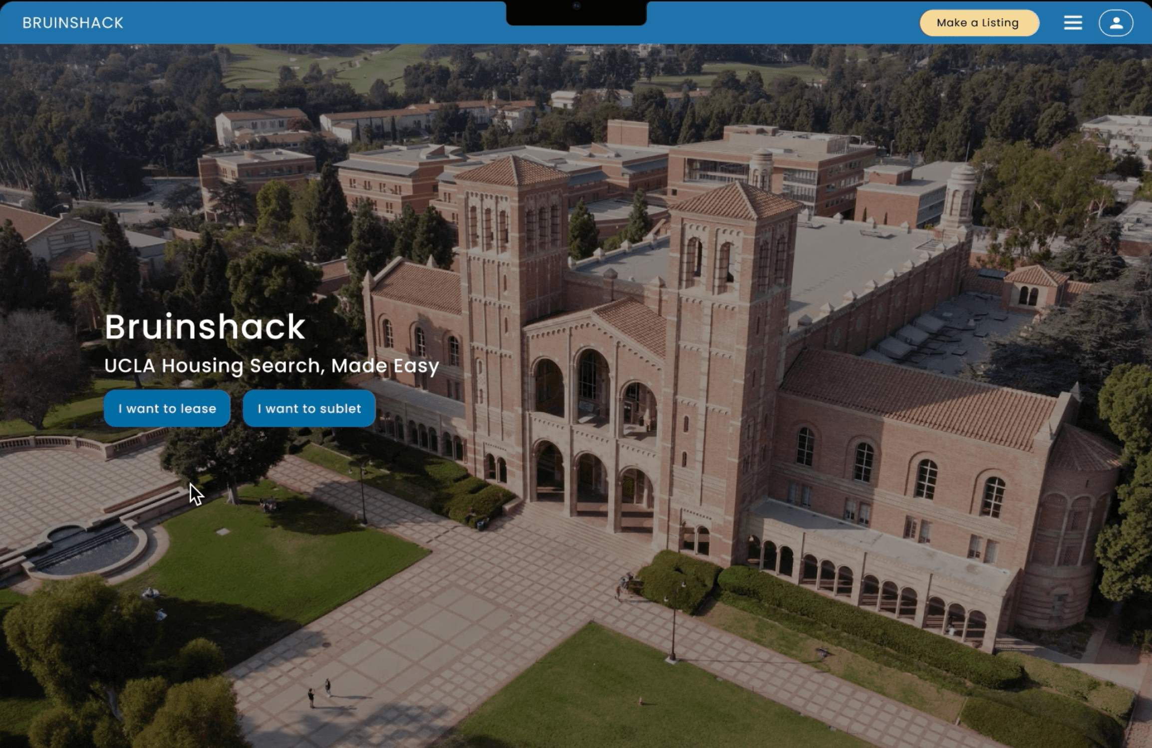
This is the end of the case study!
Thank you for reading!
After the pandemic, the student housing needs had changed.
Subletting had become more common because people were forced to moved about, and students needed to know the policies and level of safety buildings provided.
This is where me and my team came in to do a redesign. I worked with 2 other designers, 1 manager (the founder of BruinShack), and 3 SWEs. We were told to approach this like a slightly long version of a design sprint, and completed the major redesign in 8 weeks, after which we worked on refining and releasing our product, attempting to reach 100 monthly users in June and July 2023.
BruinShack is a housing search platform that puts students first. It prioritizes having an updated centralized directory, transparent pricing, and honest student reviews.
What is the product?
What is the issue?
What was my role?
Product Design Internship
April 2023 - July 2023
3 Designers (Me!), 1 Manager, 3 SWEs
Context
Research: Qualitative Interviews, Five Second Testing
Design: Sketching, Wireframing, Prototyping
Roles & Responsibilities
Figma
FigJam
Pen + Paper
HTML + CSS
Tools
How do we complete the product goals in 16 weeks?
Approach
1
Research
Interviews
Design Critique
Ideation
Concept Validation
2
Design
Wireframes
Finalised Designs
3
Testing
Evaluations
Marketing
Solution
Reflection
Student housing needs changed after the pandemic.
Student housing needs changed in 2 ways.
Problem
These issues were the target for our redesign. Based on them, we decided on some product goals.
Subletting culture became popular
People spontaneously moving back home, having to quarantine for COVID, moving to care for their partners, etc. meant that the subletting market was the BIG thing.
Taking protective health measures became important
Buildings had to update their policies, hygiene standards, COVID guidelines, and students required up-to-date information to choose a safe home.
1
Allows for students to complete their end-to-end subletting process
2
Includes up-to-date information about building standards/rules
3
Has an updated appearance and identity
Product Goals
Solution
Sublet Feature
Upfront addition of new feature, Improved visuals
Improved queries and filters
Finding specific apartments requires fewer clicks and is less overwhelming
Descriptive ratings
Evidence provided to students about quality of homes
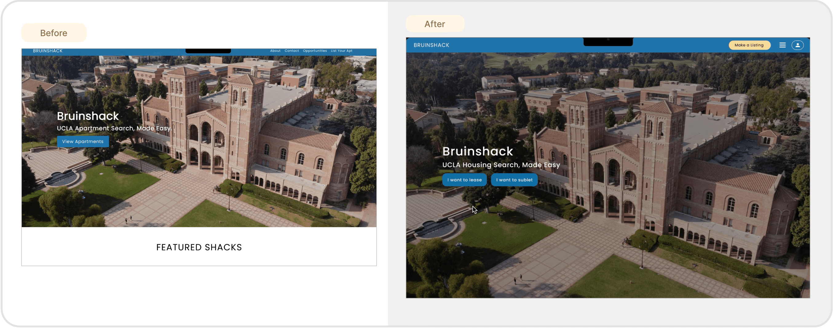
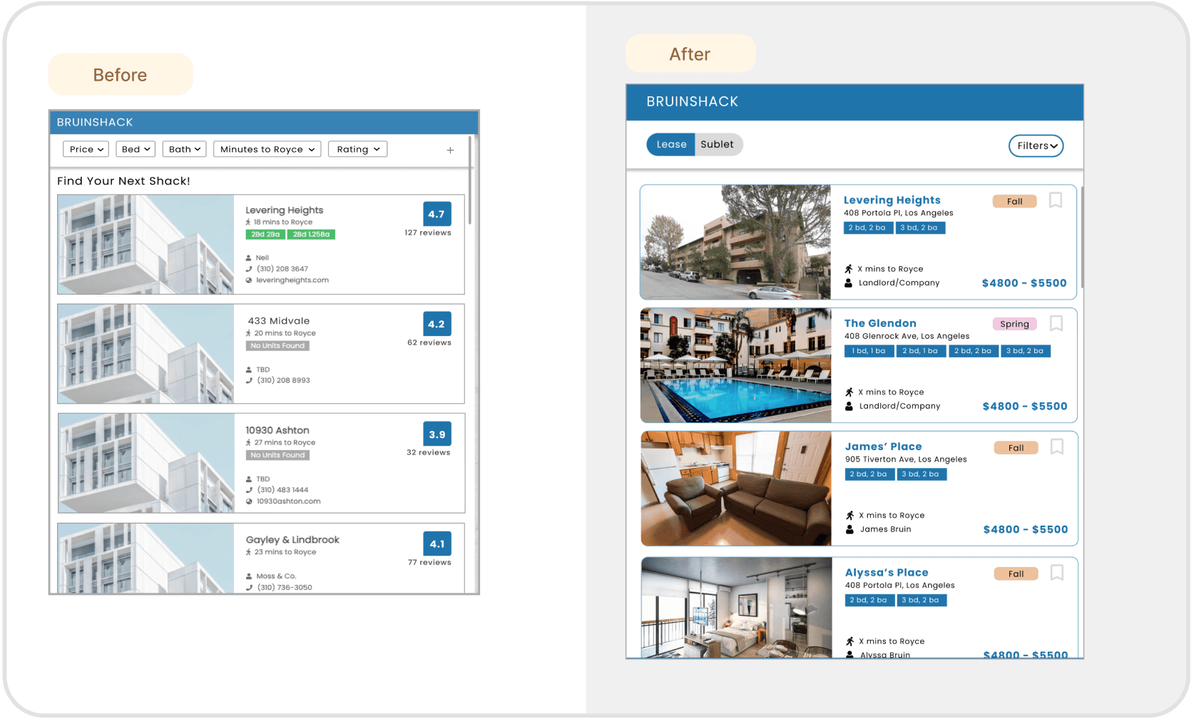
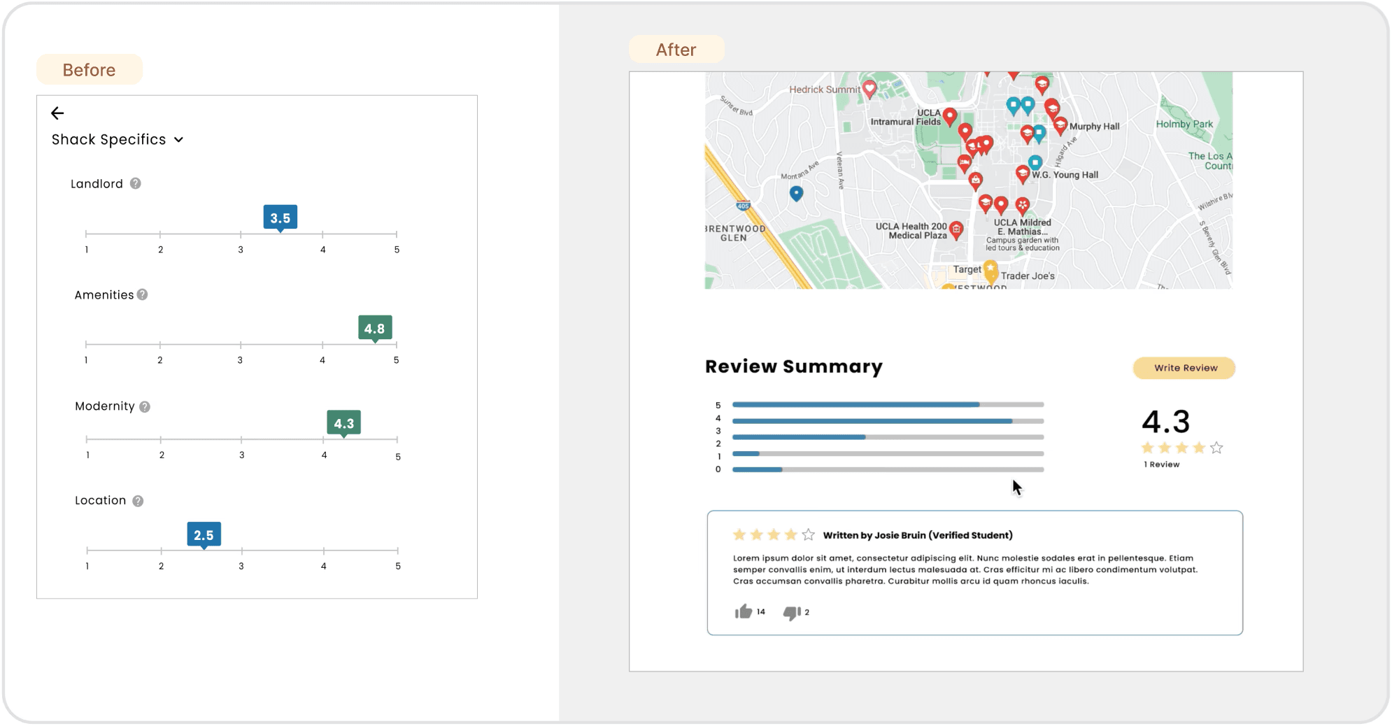
The previous design did not align with the user needs.
We did not want to start a design from scratch. So, we did an Audit of the existing site to narrow down the parts we wanted to change. Critiques of 2 main frames:
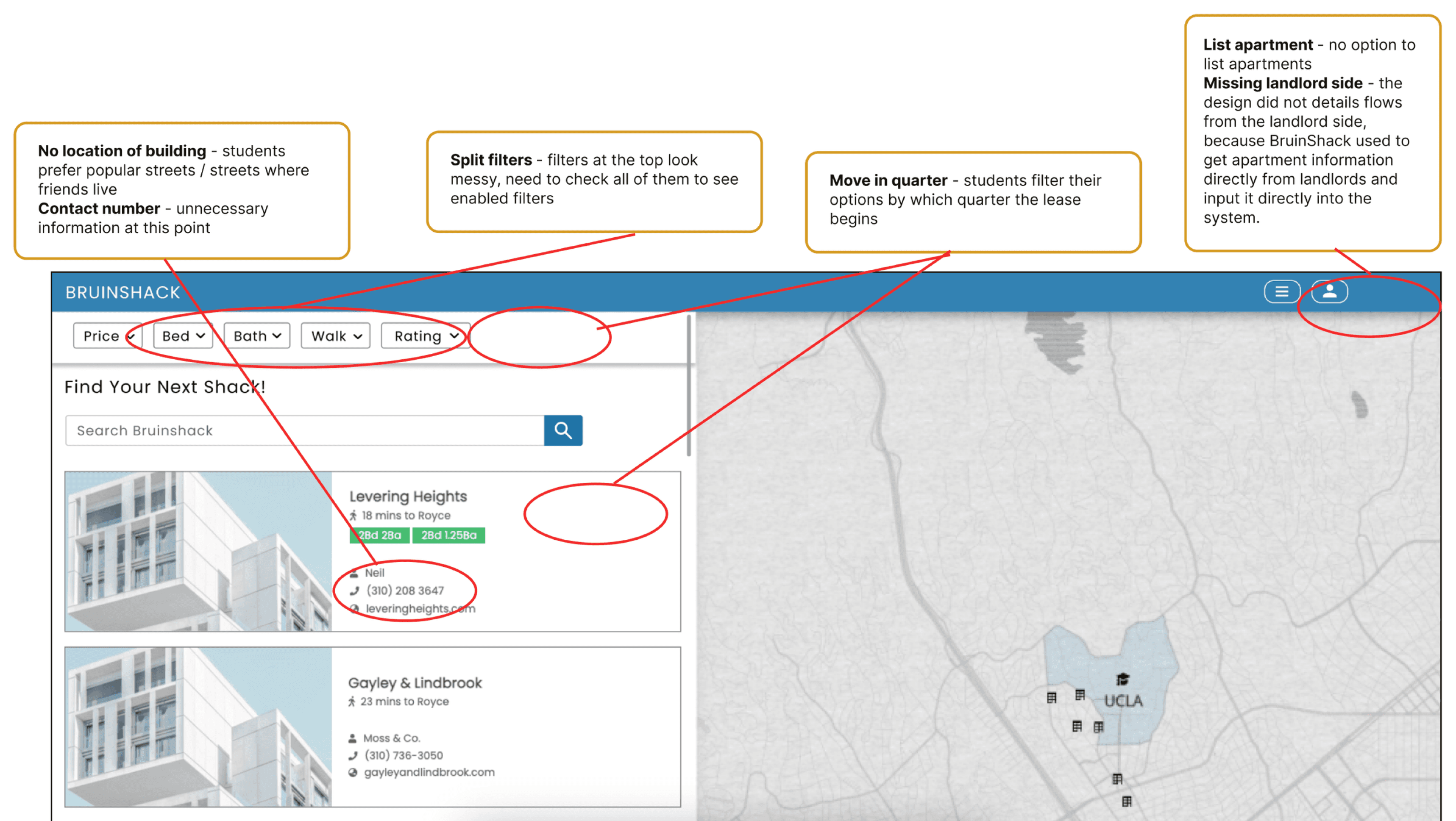
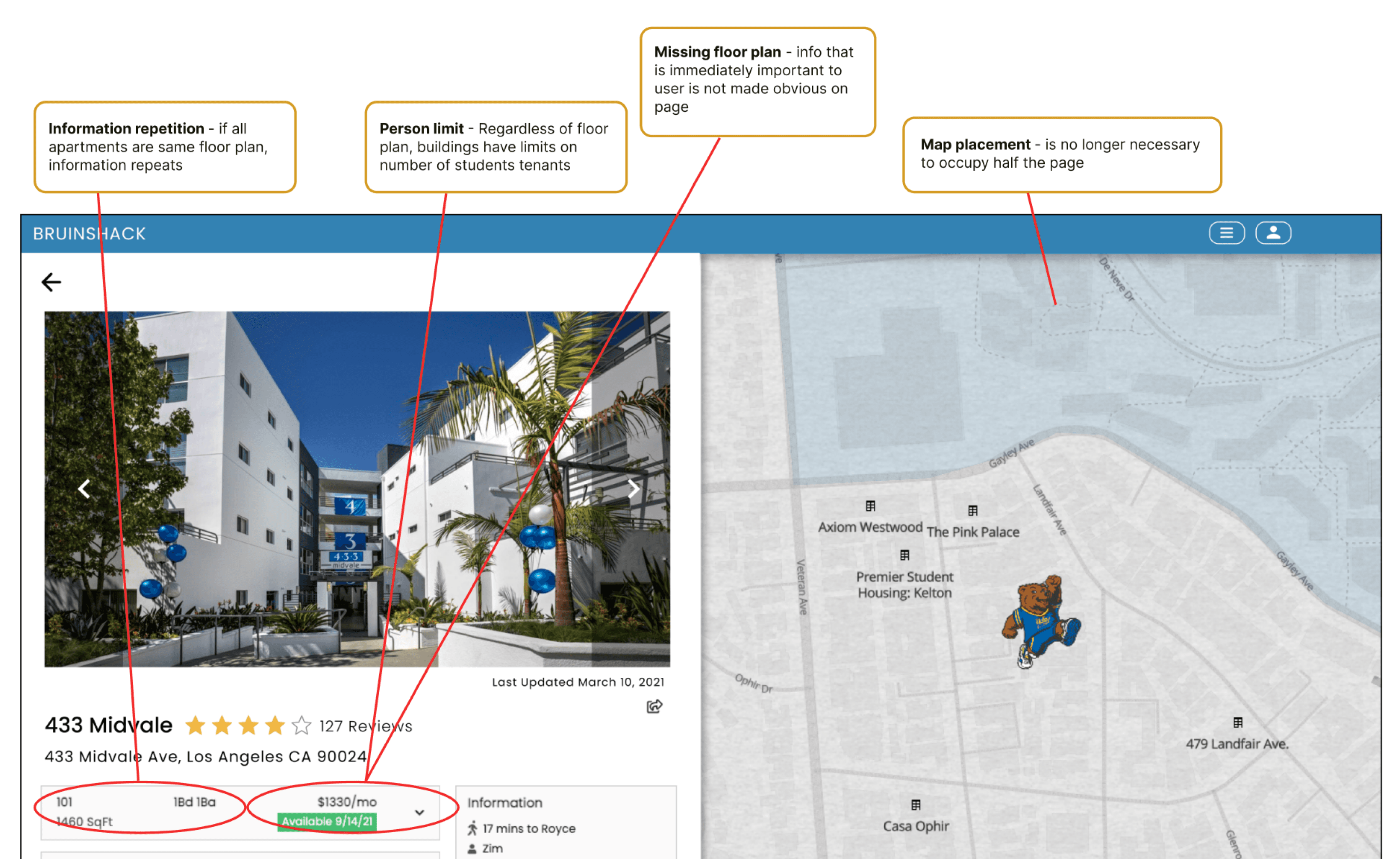
This gave us direction into what aspects of the website we needed to change, and how we could streamline the redesign process.
What can the changes look like?
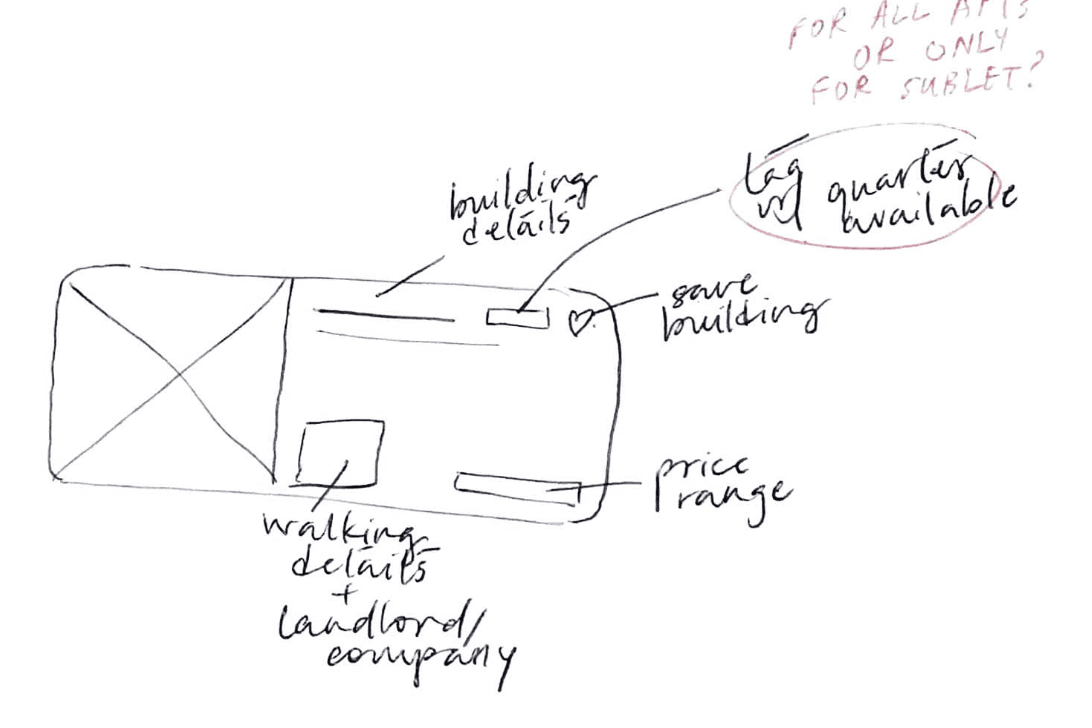
Apartment cards on dashboard
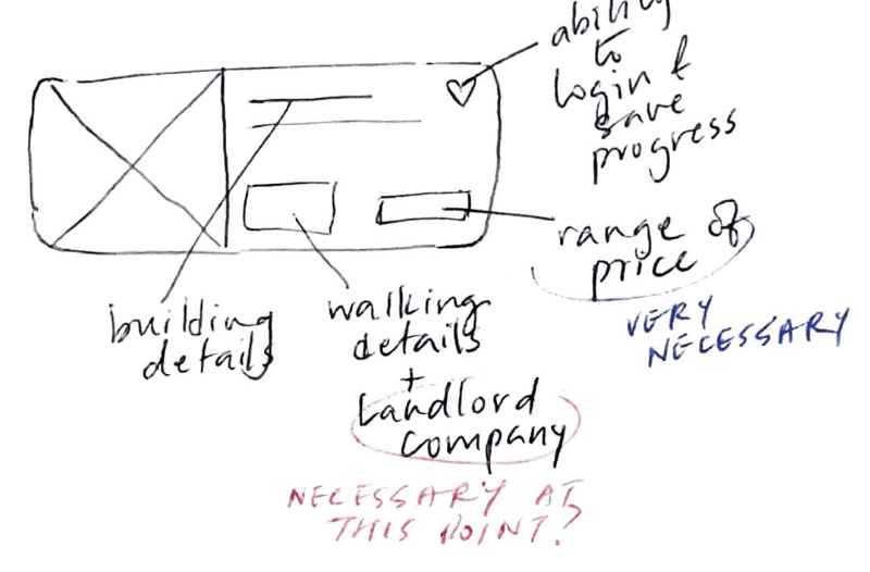
Option 1
Option 2
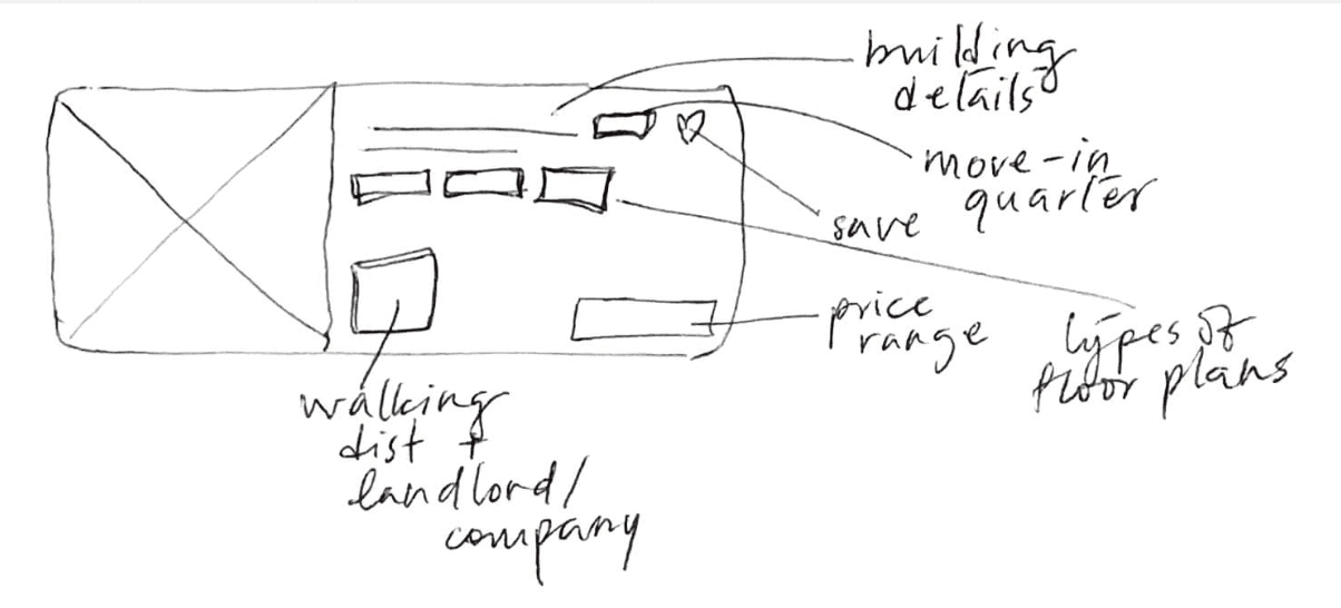
Option 3
Final Sketch
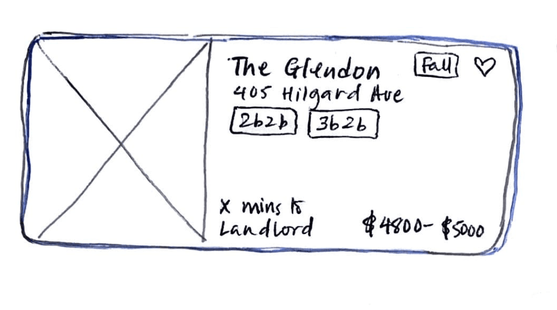
Displays most important info first:
Floor plans
Price range
Move-In Quarter
Allows students to save apartment
No unnecessary details, e.g. phone number (students don’t call landlord until later in the process)
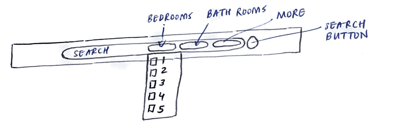
Filtering
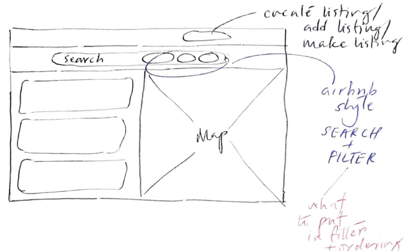
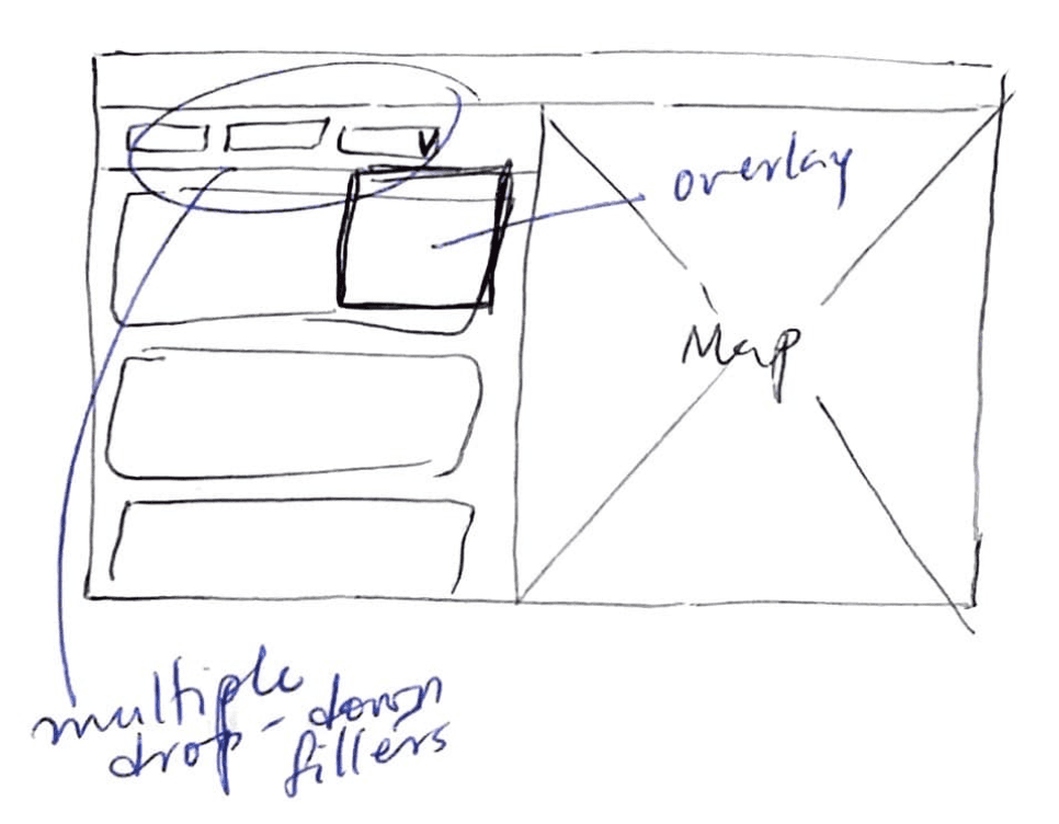
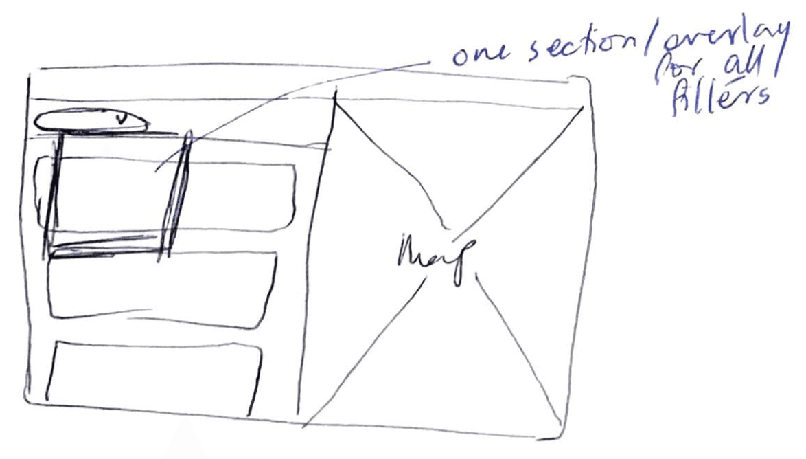
Option 1
Option 2
Option 3
Final Sketch
Listing Page
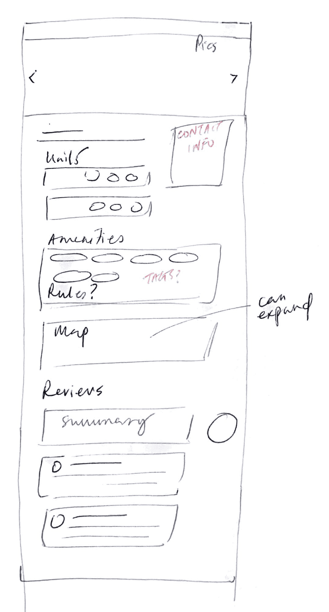
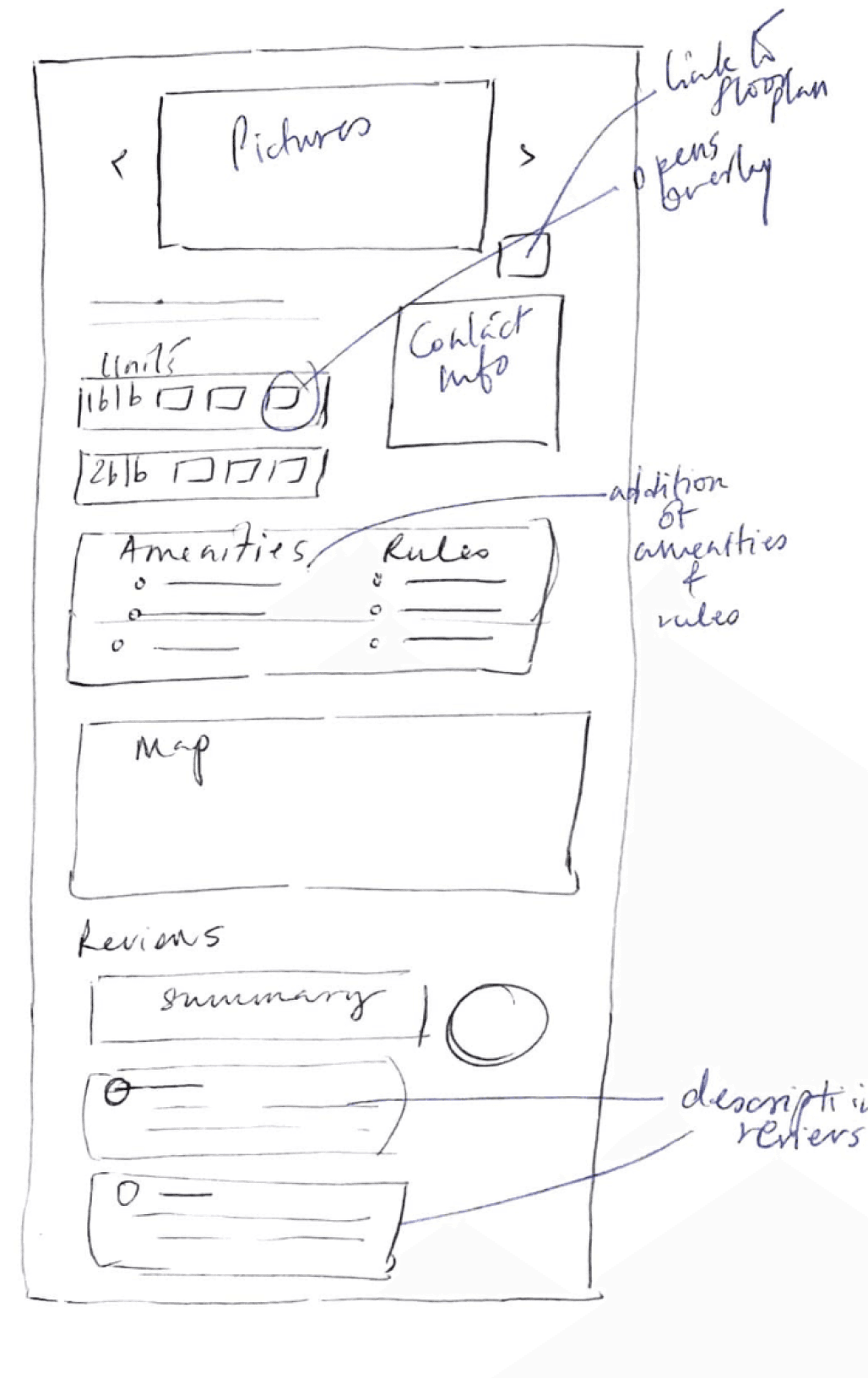
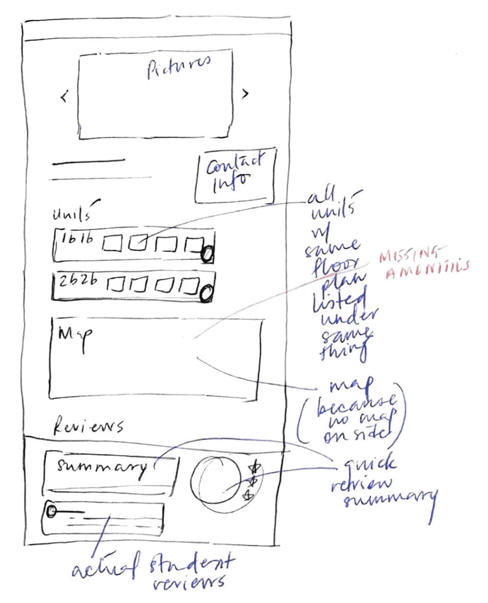

Option 1
Option 3
Option 2
Final Sketch
Uses full width of page for information
Having units in one place avoids repetition
Summary of reviews + actual reviews themselves (this works because people can login from UCLA ID, so already verified)
Final Sketch
Do users like these changes?
We conducted a session of Concept Validation with 2 UCLA students.
This session was held as a focus group discussion, giving space for participants to bounce their ideas off with each other.
Since the design was extremely low-fidelity, we wanted to focus on the key frames, but also keep the discussion open to design aspects around these frames, like the preferred user flow.
Takeaways:
Filtering through multiple drop downs is nice at first, but annoying to change
Floor plans should be next to their unit-types
Show what amenities are possible to have, didn’t know what were common practices
Display that students are UCLA verified, lots of fake reviews online that mislead
Based on this feedback, we implemented changes into the design of the website.


✅
✅
✅
Can search and filter in same space
Most important filters take precedence
Multiple option select for customized results
This finding immediately piqued my interest, because BruinShack prided itself over being “made for students, by students”. If we had the student body’s support in this project, we would have a way to source robust peer reviews.
💡 Peer reviews could be the Unique Selling Point of BruinShack.
I made sure to champion this point in future meetings.
Findings:
Robust reviews were necessary to make informed choices
No single platform to search for both rentals and sublets
Availability by quarter is not a filter/tag housing sites use
Searching by floor plan is easier because students have roommate groups
Methodology
31 semi-structured interviews
4-minute duration per interview
Location: BruinWalk (central campus area)
Participants: UCLA students aged 18-25

Focus
Current housing search methods
Pain points in finding accommodation

“I struggle the most to find sublets. Facebook is getting kind of old, and reaching out to friends seems like an uninformed way to do research”
“I didn’t know that my apartment building did not care about COVID stuff. It was really annoying.”
“I’m feel like the reviews on Google and Apartments.com are super polarized. I want to read balanced and verified reviews before making housing choices.”
“I already have a roommate group, so I prefer searching by floor plan”
To gain insights into students' housing search needs, we conducted a series of brief, semi-structured interviews on the UCLA campus. zOur approach prioritised reaching a broad sample of students within their time constraints.
This rapid interview format allowed us to efficiently gather diverse perspectives from our target user group, providing a foundation for our design process.
Research
Users have metrics to search for housing.
A 312.5% increase in users :)
Before the redesign, the website was receiving 48 views on average per month. After the redesign, the website has been receiving 198 views on average per month.
We have 312.5% increase in users!
While redesigning BruinShack, I was also searching for an apartment, which made designing for users like myself both refreshing and personal. Every change we made felt impactful, knowing I could benefit from it. Working with my first proper design team came with challenges, but questioning every decision led to a much stronger final product.
This experience taught me that with continuous iteration and team collaboration, the result can exceed expectations.
Thanks to Danny for hiring me, Emmy and Kanchan for their support, and the student body for their valuable feedback and kindness!
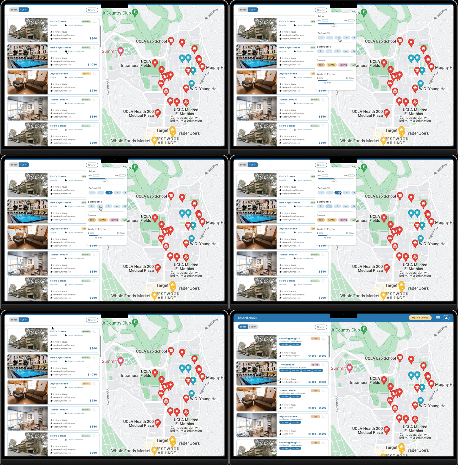
Improved filter design.
Prioritizes commonly used student metrics for housing search
Better spacing and presentation, does not overwhelm users with options
Easy to change/update filters

Switch between lease and sublet.
Subletting interface for students looking for shorter-term leases
Ability to see subleases for groups
Tags for properties to display standout information

Student Reviews.
Clear section for student reviews to utilize the student body network
Clear call-to-action for users to add reviews to application
Final Design
A one-stop housing solution
Testing

18 users participated

5 seconds per wireframe

5 key user insights
Did not know that I could multi-select (6 users)
I wanted to sublet with my friend once, this would be super useful for that (3 users)
There were cute colours on the filter panel (7 users)
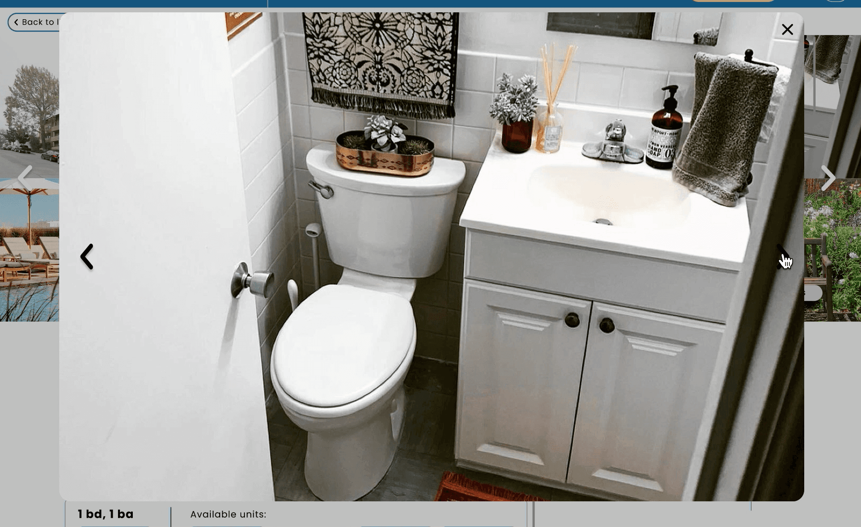
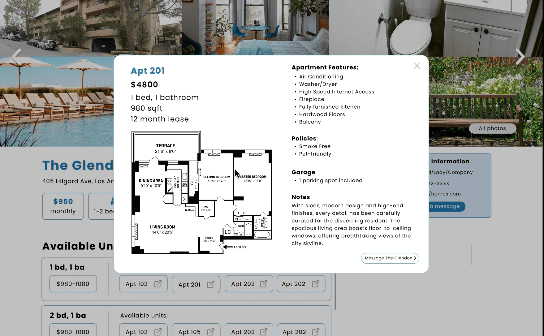
Apartment description was a little crowded and boring
(6 users)
I couldn’t see the arrows clearly on the pictures page. (5 users)
We acknowledge the limitations of this method.
5 users gave us criticism that they were unable to focus on any of the features. 11 users said that they were generally happy with the application.
While we couldn’t implement these changes in this iteration of the project, we would like to make changes based on these in the future.
Marketing the new product!
Our goal was to have 100 active monthly users, for at least 2 months (after the redesign), so we got to work on the marketing. Our strategy comprised of 3 things:
To increase number of users on website, spread the word that a website like this exists
To use the student body as a means to make the website more robust
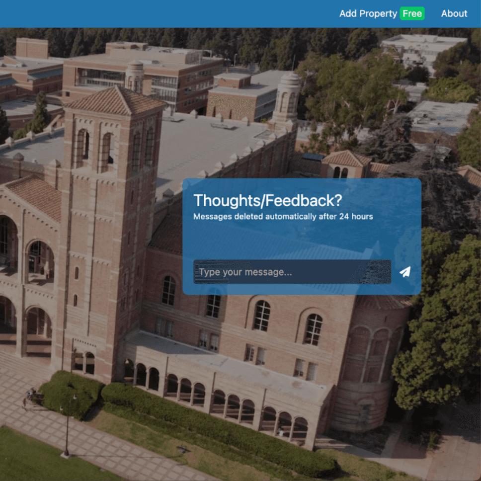
To conduct user research through user-feedback requests


Our design does the job.
Evaluating with users.
With our high-fidelity prototype ready, we wanted to test it with users. We chose to pursue 5 Second Testing as our usability testing method, because it’s:
Fast
Relatively easy to organise
Similar to how we believed users would interact with our site
Would it hold their attention?
Would they remember the features?
Key findings:
1
Social Media Marketing
2
Student Reviews and Incentive
3
Student Feedback on Website
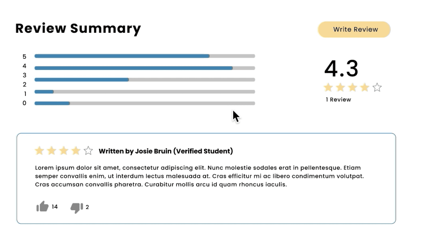
This design looked a crowded compared to the other components in our system.
Reviews option 1
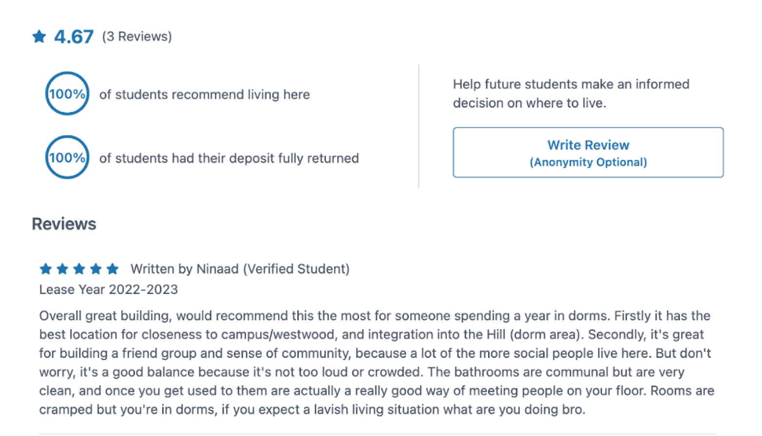
This design encouraged users to write reviews, while displaying the most important information.
BruinShack did not receive enough reviews to warrant for a search filter system.
Final review system
Reviews option 2
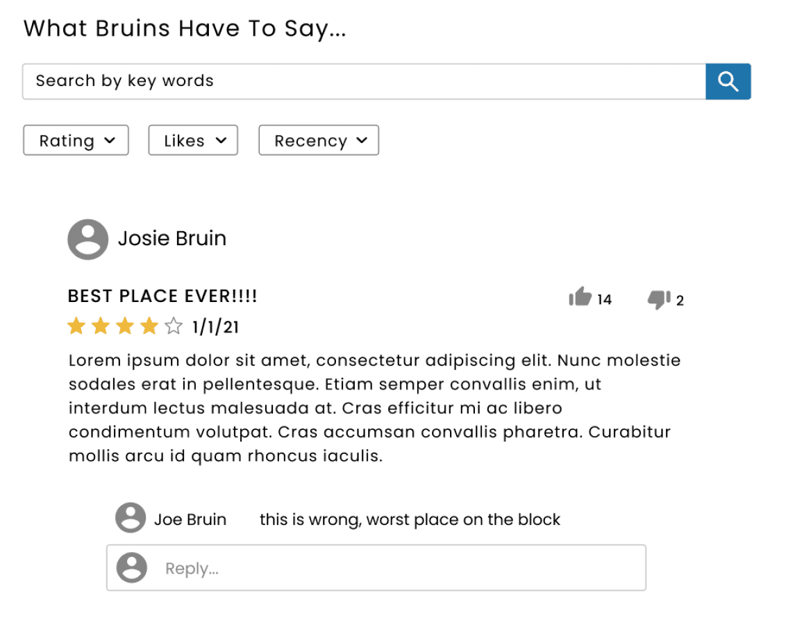
The listing page had to display a lot of information without overwhelming the users. After choosing the sections on the page, we iterated on what each section could look like. Here are some ideas we had about the Reviews section.
Final Apartment Card:
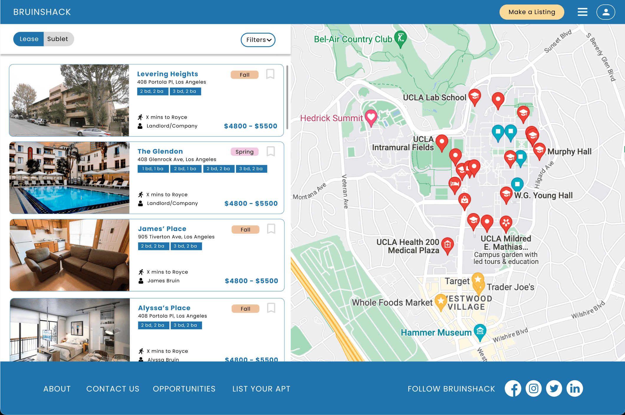
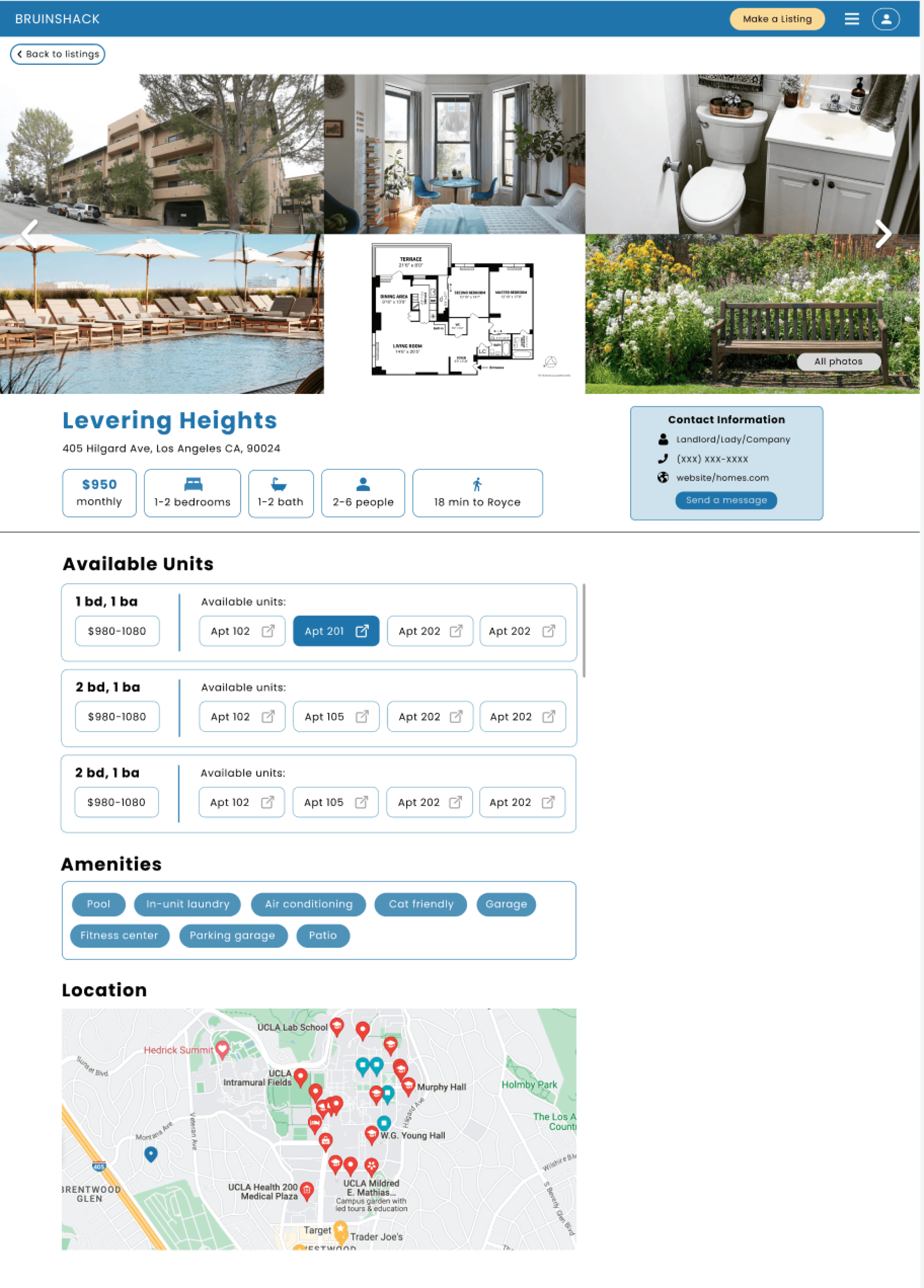
Final Listing Page:
Floor plans tags
Upon clicking:
The listing unit will expand to become the larger listing unit
+
Route to Royce Hall will be highlighted on the map
Easy preview of key features
Clear action to go to full listing
Price range of units
Ability to save apartment building for future
Move in quarter tag
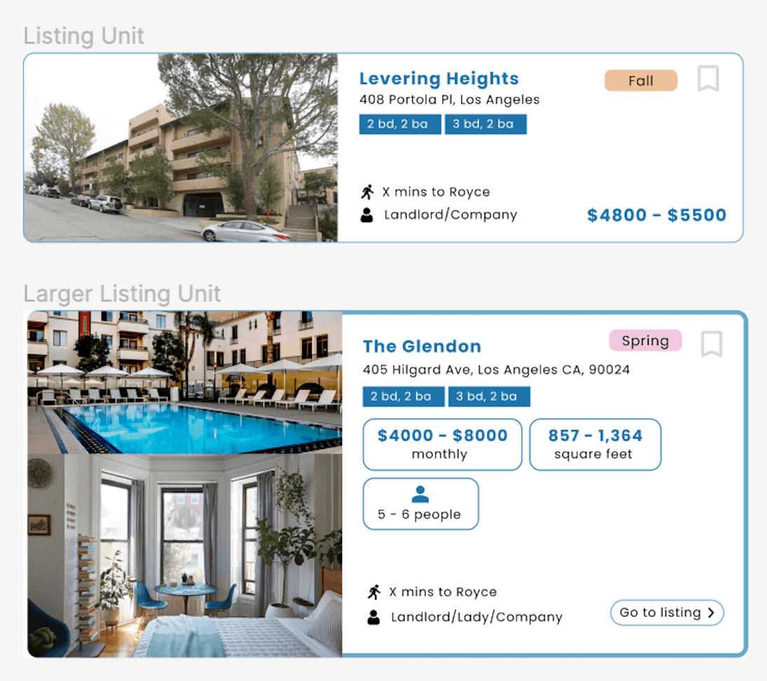
For the apartment cards on the dashboard, users mentioned that instead of jumping into a listing, they preferred first seeing the route to Royce Hall (central point on campus), and then going into the apartment listing.
Design
Turning ideas into high-quality designs.
A new set of wireframes!
Since we did not need to change the whole layout of the website, we were able to skip directly to the high-fidelity wireframing stage.
Experimenting with the Filter feature:
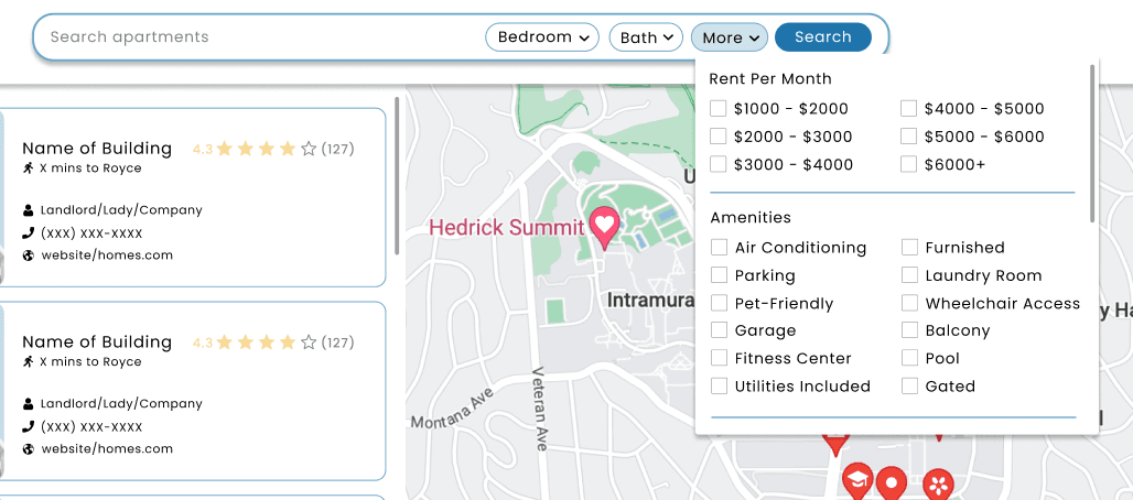
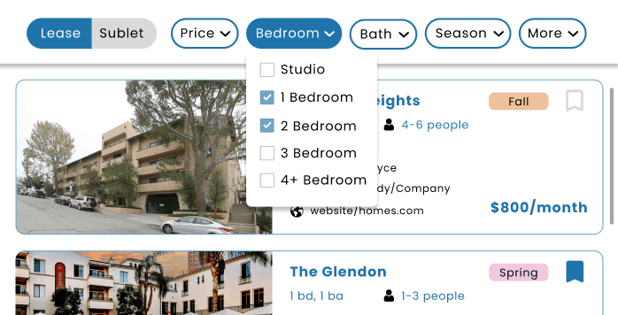
As the users correctly predicted, these options were difficult to change, and they had too many checkboxes.
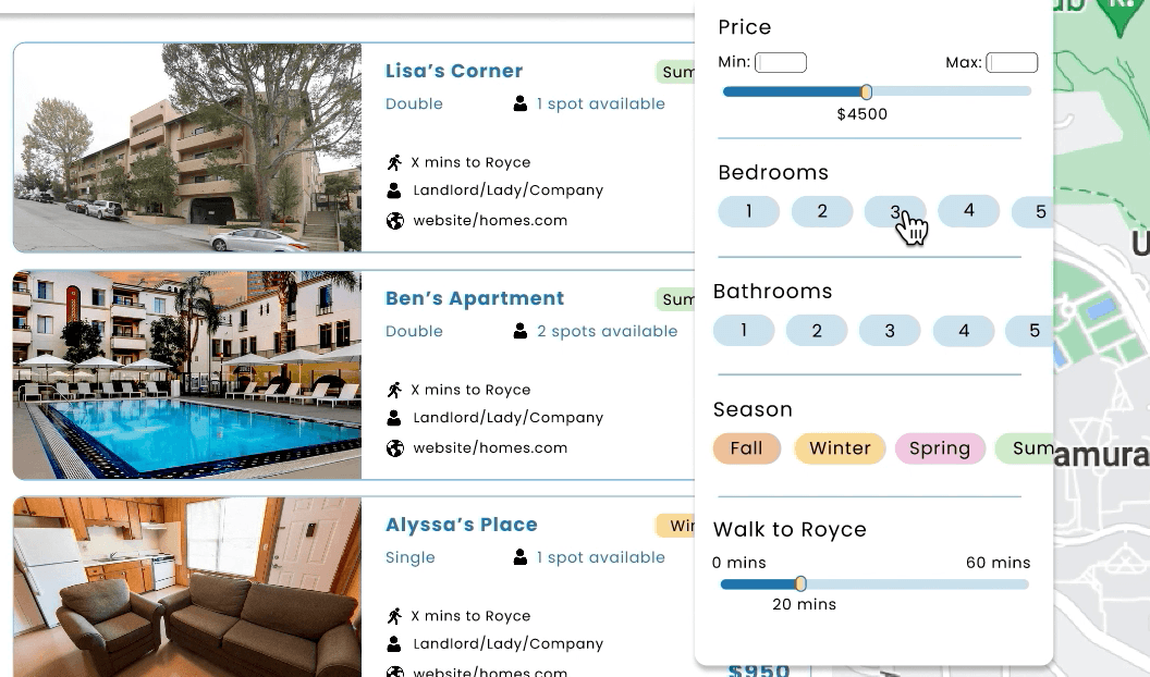
Final filter system:
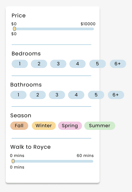
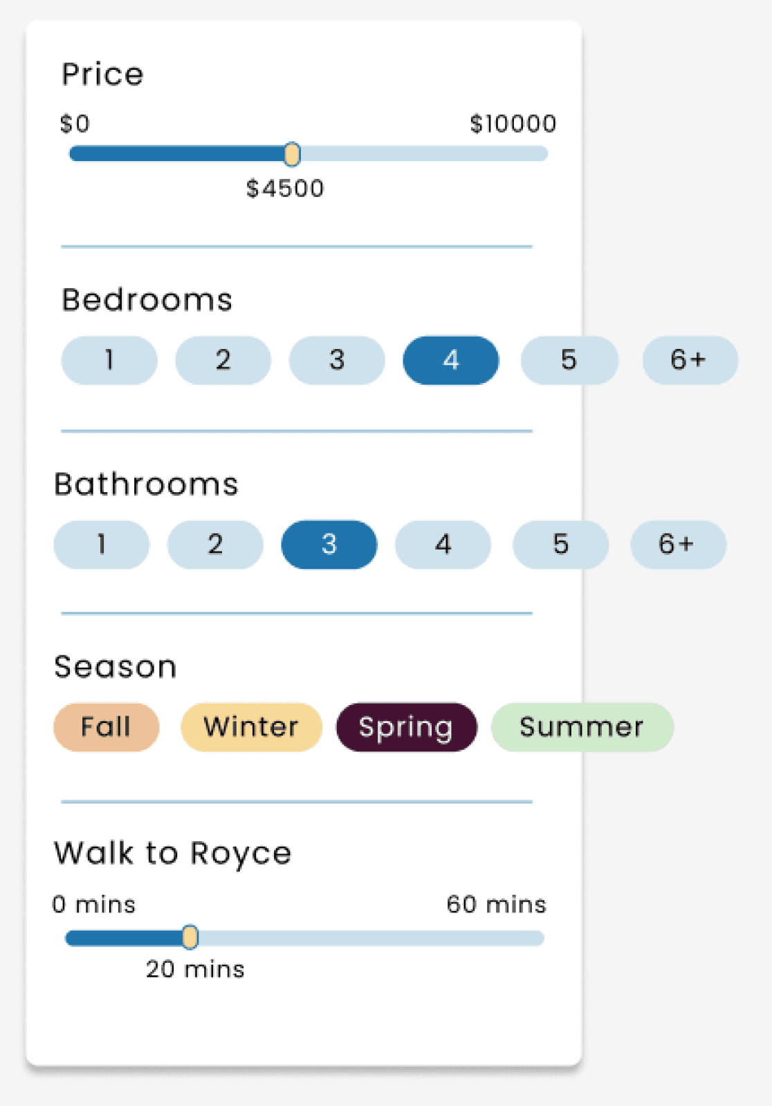
Options unselected
Some options selected
Slider instead of checkboxes
Colours to depict choice instead of checkboxes
More minimalistic
More fun through colour!
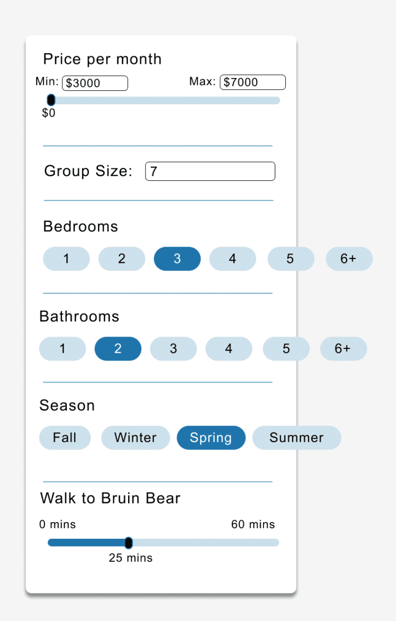
A better version!
Experimenting with the Apartment Card feature:
Experimenting with the Listing Page:
Listing Page design
Amenities can be greyed out depending on what is unavailable
Units displayed in categorized manner
Clear way back to home page
Contact info moves up and down with scroll
Full spread of photographs, with floor plan
Most essential displayed immediately
Offering peer reviews, transparent pricing, and comprehensive listings, BruinShack equips students with information needed for a successful housing search.
One-Stop Housing Solution for Students
